Common Screen Resolution for Web Design in 2026
Updated on 30 January 2026
Summarise this article with AI
Web design has come a long way since the beginning days of the internet, where a website was pretty much equal to a web page with some text on it.
\n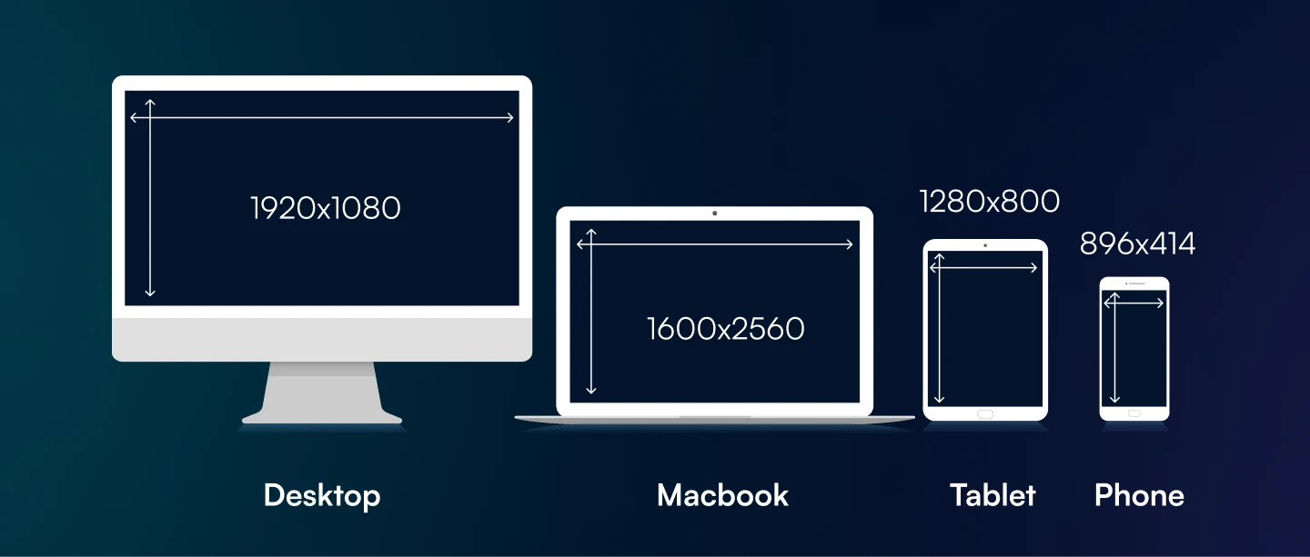
Nowadays, websites store much more content and perform tasks that Tim Berners-Lee himself likely couldn’t have envisioned. But with all the new possibilities come new rules for creating modern websites. Not following these rules can often translate into frustrated users and poor performance in marketing efforts.
One issue that may seem confusing to some has to do with the user’s screen resolution. Devices come with various screen sizes, and if you want to make sure your site can be accessed on all of them, you likely want to know what’s the ideal screen resolution to design for, which is the topic of this article. Let’s get started.
You might also be interested in WHAT IS THE BEST WAY TO TEST RESPONSIVE WEB DESIGN?
At a Glance
Most common screen resolutions
Approx global share. Design responsive first; these are the breakpoints that matter most.
What Is Screen Resolution and Why Does It Matter?
Screen resolution is a two-dimensional metric that refers to the sharpness of a device display. Resolution is measured in pixels along horizontal and vertical axes, and the higher the number of pixels of the two axes, the higher resolution the screen is.
Web pages are designed to display content based on pixel dimensions, and the graphic elements in it are shown based on their pixel size. As a result, an image that has a 20×20 pixel size will appear bigger on a lower-resolution monitor, because that monitor needs more space to display those pixels. In the end, the higher a monitor’s resolution, the more a person can see on the screen.
When it comes to a target audience, the screen resolutions can be as diverse as the users themselves, which creates a big problem for websites. You don’t want to keep someone from using your site (and converting), simply because they have the wrong monitor size, which is why the question of “ideal screen resolution” comes into play.
The Importance of Responsive Web Design
Let’s first consider the most common screen resolutions for different devices:
- Desktop screens: range from 1024×768 to 1920×1080
- Mobile devices: range from 360×640 to 414×896
- Tablets: range from 601×962 to 1280×800
These are pretty significant variations in screen size. Even if you compare two similar types of devices, their screen size may be completely different. For instance, the average laptop screens have a resolution of around 1920 x 1080 pixels, while MacBooks come with a native 2560×1600 resolution.
The gap is huge, even if technically both are laptop screens. If you don’t account for these differences, a browser window may show your website in completely different ways for each device.
Screen sizes are diverse, which is why there is no fixed screen resolution to design for when creating your site. Instead, the focus should be to create a responsive website that can adapt to the different screen sizes your website visitors may be used to, and offering them the same experience.
Responsive web design is the practice of using HTML and CSS to automatically resize a web site and ensure it looks good on all devices, no matter its resolution. A responsive website should look and work both on a smaller screen, and a high-resolution screen without it affecting user experience in any way.
How to Design for All Screen Sizes
To design a responsive website, there are a few tips to keep in mind:
Establish the Breakpoints
In responsive web design, the breakpoint is the point at which a website’s content and design must adapt to provide the best user experience. By adding a breakpoint, designers and developers can fix any content that appears misaligned, and ensure the page is responsive,
Create Fluid Designs
Fluid design means that a layout is able to change its size to fit the window size of the user, while a fixed design distorts the layout to fit each viewport.
Fluid design is achieved by using percentages and max-widths as opposed to fixed widths to ensure the layout fits on both mobile screens and doesn’t become too wide for desktop ones.
Reduce Page Friction
Friction in web pages refers to anything that makes it more difficult for the user to properly view and use the page. A good rule of thumb is to focus on reducing friction for smaller screens since these are the ones that pose the most difficulties.
For instance, when you’re going on a site from a PC, your mouse allows you to easily click on any elements and scroll through the page. On a mobile device, however, the user doesn’t have the same options, as they need to touch the screen to scroll. A mobile page with a lot of friction would mean the user cannot scroll down without accidentally tapping on another feature, which can ruin their user experience.
Another common friction example is a pop-up that needs to be manually closed for a user to continue to view the page content. Pop-ups may be needed to push certain information, but you need to make sure mobile users can easily close that window from their device.
Over to You
To conclude, designing sites with a specific resolution in mind is not a good approach. If you target high-resolution screens, you risk losing a lot of mobile users, and since half of the global traffic comes from these devices, that’s not a good strategy. Conversely, designing for mobile-only may block people with bigger screens from getting a good user experience on your site.
But Australian Internet Advertising can help create a high-quality responsive website to allow your Sydney business to reach its target audience and improve its profits. To work with us, all you have to do is contact us online, or call this number: 1300 304 640.